Fast Browser Animations
May 21, 2020
Animations are challenging!
Even seemingly simple animations can be expensive for the browser to compute, grinding your computer to a halt.
I’m by no means an expert on the vast world of browser animations, but I’ve been reading a lot about them over the last few months as I implement animations for various projects. This wil mostly be a collection of notes and links that have helped me make sense of what I’m working on.
Before we continue, you should go read High Performance Animations from Paul Lewis and Paul Irish.
Animation Cost - What’s Cheap?
Not all animations cost the same when it comes to CPU resources. Just because you can animate a property, doesn’t mean that you should animate it.
As a general rule, the only things you can reliably animate for cheap are:
opacity: opacity: 0.5
position: transform: translate(10px, 10px)
rotation: transform: rotate(90deg)
scale: transform: scale(1.1)
Why?
Every time a browser is going to render, it checks what changed. If the change forces it to recompute one step, it must also recompute all the following steps.
The earlier in this render process that your animation causes a change, the more work the browser has to do, and the slower the page will be.
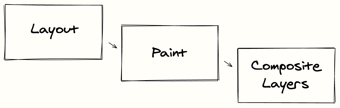
Layout: Where are the elements? What size?
Paint: Determine the pixels for each layer, what do they look like?
Composite Layers: Draw layers onto the screen in the correct order.
Let’s break these down a little more.
Layout
When the browser calculates layouts, it’s looking at things like width, height, padding and margins. This step is primarily concerned with calculating where things are and how big they are.
An important thing to keep in mind for layout changes is that adjusting the layout of one element can often change the layout for many others. This forces the browser to recompute layout for every effected element (expensive!).
Common CSS properties that trigger layout: width, height, padding, margin, display, border, position, top, left, float, text-align.
Example of an animation that triggers Layout, Paint and Composite Layers: (Usually you don’t want to do this. We’ll look at a better way soon.)
.item {
  width: 100px;
}

.item:hover {
  transition: width 1s ease;
  width: 110px;
}
Paint
Painting is the process of converting rules in to pixels. Here browsers are concerned with things like colors, text, images, shadows and other appearances.
Depending on the grouping of elements into layers, an animation that requires painting can effect other elements besides the one you’re animating.
Common CSS properties that trigger paint: color, border-style, visibility, background, text-decoration, outline, box-shadow.
Example of an animation that triggers Paint and Composite Layers:
.item {
  color: magenta;
}

.item:hover {
  transition: color 1s ease;
  color: transparent;
}
Composite Layers
The Composite Layers step can also be thought of as ‘combining layers’. The browsers lines up layers and applies them in the proper order.
This is the last step in the rendering process, and is the least intensive to alter. While creating layers can be intensive, altering them is usually a lightweight operation.
If work can be kept within the composite layer step, and it will be handled by the GPU. To make sure this happens, the element that is animating must be within only one layer! Most browsers will handle this for you if they see a CSS transition on opacity.
Common CSS properties that trigger composite layers: opacity, transform
Example of an animation that triggers just Composite Layers: (a faster version of the width animation)
.item {
  width: 100px;
}

.item:hover {
  transition: transform 1s ease;
  transform: scale(1.1, 1);
}
Keeping Common Animations Fast
It’s time to get creative!
The goal is to keep animations at 60 FPS so that lag isn’t visible to the user. You can find info on monitoring FPS with FireFox’s DevTools here.
There’s a number of ‘tricks’ to keep animations fast. Keeping in mind how the browser renders, we can try to move our animations to that last render step - Composite Layers.
This imposes a large constraint on us – now we can only animate opacity and transform: translate|rotate|scale.
Using Opacity
Opacity may at first glance seem very limited in scope, but it can allow us to make animations such as fading elements in or out, or flashing dots. Lots of loading animations can make use of opacity.
While it may seem like changing opacity should affect the paint step, the browser can actually perform this animation within the composite step. When the browser combines layers, it will apply this layer with a different alpha value, thus making it more or less opaque without having to repaint.
Here we can use opacity to make a red dot blink 3 times. No color changes are necessary.
.red-dot {
  background-color: red;
  width: 12px;
  height: 12px;
  border-radius: 50%;

  animation: blink 1s ease 3;
}

@keyframes blink {
  from,
  to {
    opacity: 1;
  }
  50% {
    opacity: 0;
  }
}
Using Transform
Transform can be much more versatile. With a bit of creativity, it will allow us to accomplish most animation needs.
It may be tempting to move an item around using top, left or similar CSS properties. While that is perhaps more intuitive, making use of transform: translate(x, y) will keep it in the Composite Layers step.
We can use something like transform: scale(1.1) on hover for elements that we want to draw attention to. In contrast to changing the height and width, which will require the renderer to compute a new layout, paint and composite layers, this option can achieve similar effects while remaining fast.
For example, we can apply a scale to this button on hover to bring attention to it:
.button {
  /* button styles */
}

.button:hover {
  transition: transform 150ms ease;
  transform: scale(1.1);
}
Making use of transform: rotate(xdeg) is often nice for transitioning icons and it can make for some playful animations.
When working with the transform class of animations, it’s important to keep in mind that these elements will be altered apart from their neighbors.
This can be confusing coming from layouts with top or width. When you transform an element, it won’t change the positioning of other elements that are laid out with respect to it (this is why we don’t have to hit the layout or paint steps again).
Other Tips
Delay your animations
When a page loads, the browser is busy doing a lot of work, delaying the start of your animations a few hundred milliseconds will reduce the load on the browser. It will also usually make them more noticeable to your user.
.animate {
  animation: blink 1s ease 3;
  animation-delay: 300ms;
}
Limit Simultaneous Animations
Animations are always demanding, and more animations means a slower browser. Often running more than two animations at once will be too intense and you’ll notice lag. It can also be very distracting to have numerous things changing at once.
You can offset animations via animation-delay, but it also takes some design thought to limit what is animating together.
Avoid Infinite Animations
If you can avoid running an animation continuously, you’ll save a lot of CPU usage by the browser. This constant usage can slow down the browser even when the page isn’t actively being viewed. It’s best to keep animations in response to an action, or something like :hover.
Learn the Performance DevTools
It can certainly be intimidating, but spend some time learning how to use the Performance tab of your DevTools. Pick an interesting topic and learn one piece at a time. FireFox has some great information on monitoring performance here.
If you’re not sure where to start, reading through the Waterfall doc will give you a deeper understanding of the browser rendering we discussed earlier.
🚨 Don’t Forget About Accessibility
There’s a few important accessibility concepts to keep in mind when working with animations.
While animations can provide a fun flair and some life to your site, not everyone can see them. Animations should not be used as a replacement for important information or cues on the page.
There’s also a property that users can set via their OS or Browser, to indicate that they want reduced motion. It’s important to respect that setting, read more about it in the prefers-reduced-motion docs.
It can be as simple as the following media query.
Given the following CSS:
.animate {
  animation: blink 1s ease;
}

@keyframes blink {
  from {
    opacity: 0;
  }
  to {
    opacity: 1;
  }
}
You can respect the reduced motion setting via:
@media (prefers-reduced-motion: reduce) {
  .animate {
    animation: none;
  }
}
Useful Links:
Remember above when I mentioned that High Performance Animations is a must read? Seriously, it’s incredibly informative, go read it.
There’s a lot of info around the web on animations. Here’s some other links I’ve found useful:
- Using the Web Animations API (MDN)
- Work with Animations (MDN)
- Animating CSS Properties (MDN)
- Performant expand and Collapse (Google)
- Performant Web Animations (Algolia)
- will-change CSS property (MDN)
- Reduce Scope and Complexity of Style Calculations (Google)
If you have any questions you can reach me on Twitter at @mguida22.
Written by Mike Guida who enjoys prolonged outdoor adventures and building stuff with software.